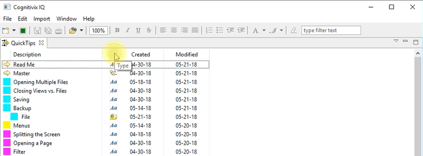
Each column in an object view represents a different type of information about the objects displayed in the view. If you hover on the header for each column, you’ll see a tool tip describing the type of information the column displays.

Default columns
The first column is the “Category” of the object. Category is a way to group objects. If an object does not have a Category, the left column is blank.
The third column represents the status of the object. If an object has been modified and changes have not yet been saved, a star appears in the status column for the object.
The fourth column represents the type of the object on each row. Hovering with the mouse over the icons that appear in this column will launch a pop up displaying detailed properties of the object. One field of this pop up is “Type”, and its value is the type of the object on the row. Examples of types of objects are Page (grid-type), Text (a block of text), etc.
Tags
The display of tags in an object view is a little different from other objects since
Tags cannot be assigned a category; and
Tags have both a textual description and an icon.
The description column for a tag shows both the text and the icon of the tag, making the tag look as if shifted to the right.
Default Order
By default, the view is sorted according the the last modified date. So, if you create a tag, then assign it to a page, the page is updated shortly after the tag was created (i.e., modified for the first time). So, the page will appear just above the tag in the default sorted order.

